The page navigation is complete. You may now navigate the page content as you wish.
Skip to main content

Side Nav

Updated in v4.8.0

Used as a contextual navigation for subpages within an application.

The Side Nav provides users with access to contextual navigation within areas of the application and generally includes subpages and nested pages within projects and organizations.

Some elements that were previously contained within the Side Nav, including the home link, help dropdown, user dropdown, and context switcher, have been migrated to the App Header. To avoid introducing a breaking change, we’ve created a Side Nav - v2.0 component that should be used along with App Header. In Ember, the elements removed were yielded in the component, incurring no breaking change.

Usage

When to use

  • When navigating between subpages and nested pages within the application.

When not to use

  • For global navigation across an application, use the App Header instead.
  • To move between views within the same context or page, consider Tabs.

Body

The body consists of a group of sections with vertical lists of links, typically to the most important parts of the application. Any generic content or component is also supported by an additional generic container.

List

With title

Side-nav section with a title

Without title

Side-nav section without a title

  • A title can help users scan the sections and provide context about the links inside each section.
  • Titles should be meaningful and related to the content within the section.

List items

Without icon

List items without icons

With icon

List items with icons

  • Use icons to help users recognize and scan the links they are paired with.
  • We recommend only using icons in the main or top level navigation.
  • Avoid overwriting color styles in icons.
Do

List items with correct use of icons

Don’t

List items with incorrect use of icons

With badge

List item with a badge

With count

List item with badge-count

With nested items

Use hasSubItems to show or signify that a link has a nested level of navigation.

List item with sub-items

Use isLinkExternal to show that the list item is a hyperlink pointing to a page outside the product or platform.

List item with a external link

Use external links sparingly. Avoid using this property to link pages that are unrelated to the product's navigation.

Generic content

The topGenericInstance and bottomGenericInstance properties support any additional generic content, local components, or Helios components within the body container via instance swap properties (topGenericInstance, bottomGenericInstance) in Figma.
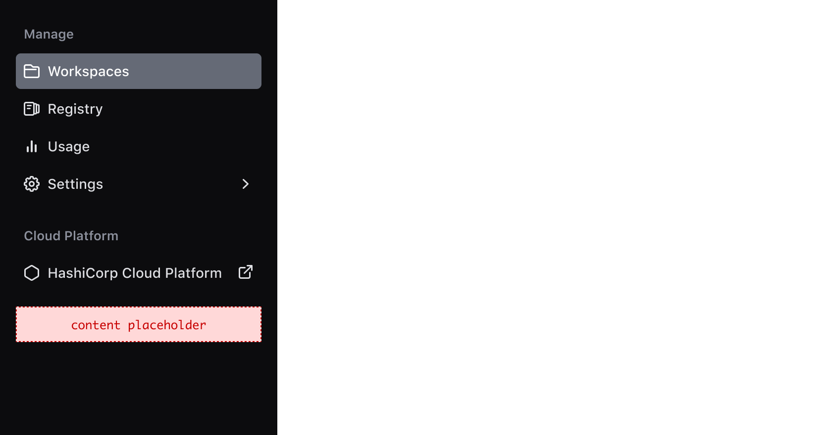
Generic container within the side-nav body

Positioning, and responsive behaviour

The Side Nav should always be positioned on the left side of the viewport, occupying 100% of the viewport height to ensure that the navigation is always visible and accessible to the user..

On smaller viewports, the Side Nav should collapse to maximize the available real estate on tablet and mobile devices. By tapping the menu icon, users can expand and access the full menu when needed.
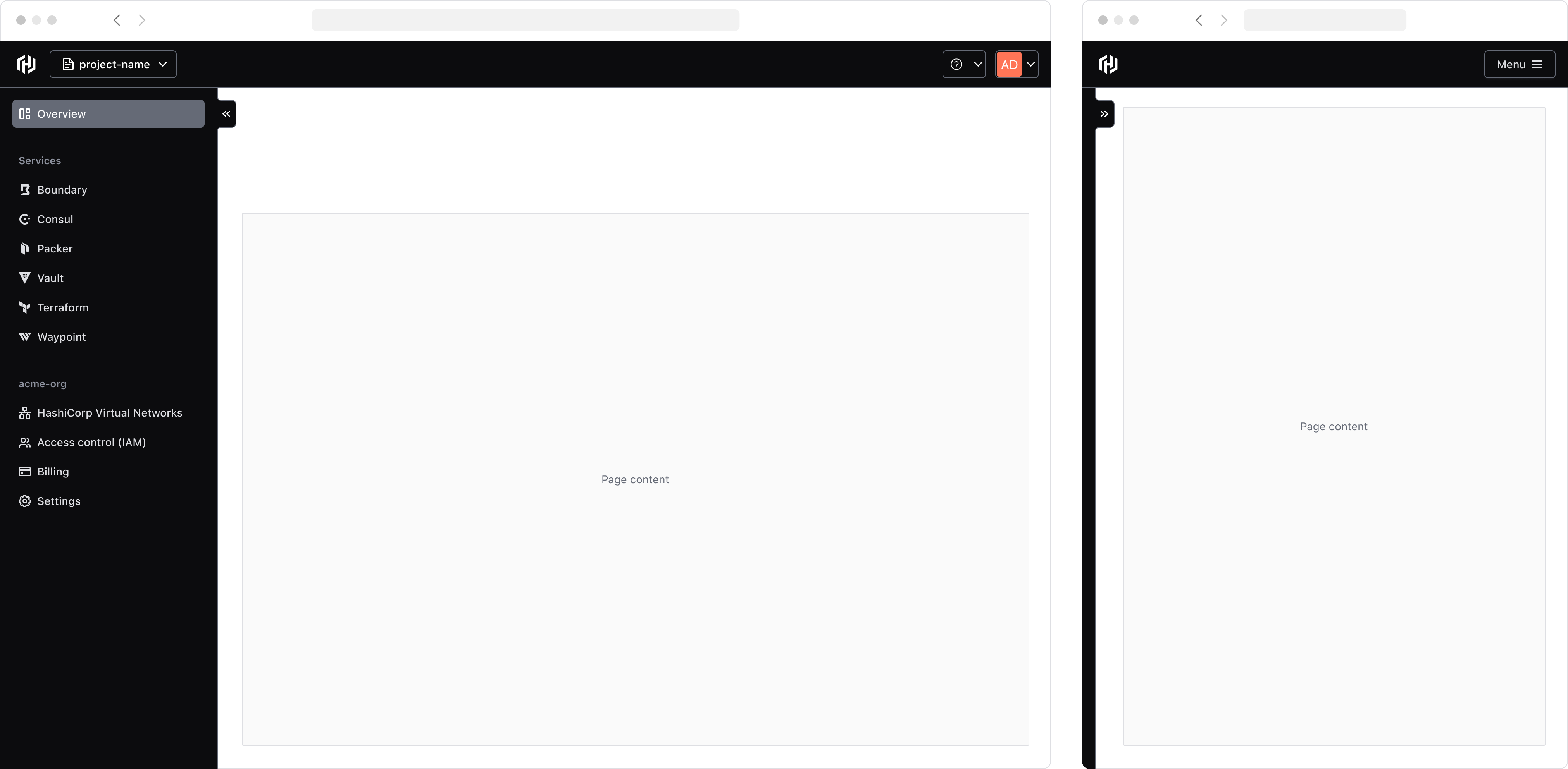
Responsive side-nav

Collapse functionality

If the isCollapsible property is set to true, a collapse toggle button will be exposed to the end-user allowing them to manually expand and collapse the component.

Side Nav collapse function

On smaller viewports, the Side Nav will be rendered in its collapsed state by default and will overlay the main page content in its expanded state.
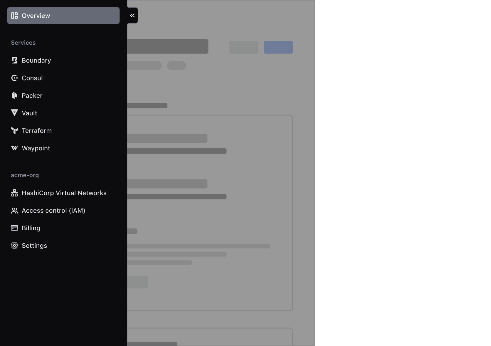
Side Nav overlay on smaller viewports

Collapsed reflow

The collapse functionality of the Side Nav gives control to the end-user to unlock more horizontal space in the main page. Thus, the main page content should reflow or reposition to occupy this space if the Side Nav is in its collapsed state. If the main page content has a predetermined maximum width that is reached when the Side Nav collapses, the content should transition smoothly to the new center of the main page area.

This is handled out of the box by the AppFrame component, but may need to be accounted for in custom implementations of the application/page layout.

This section provides in-depth instructions on how consumers can use the full-featured Hds::SideNav component to build a "standard" sidebar navigation with responsive behavior, animations/transitions, support for portals, etc.

It also provides generic guidance on how to use the layout-only Hds::SideNav::Base component to build a customized sidebar navigation (if that would be necessary).

Given the complexity and level of customization that an application's navigation may require, it is not possible to cover all the possible use cases in this documentation. For this reason, if you need to implement a navigation element using this component, contact the Design Systems Team for support.

The Side Nav component is intended to be used in combination with the Hds::AppFrame component:

  • AppFrame takes care of providing a top-level layout for the application's page, but is agnostic of what the actual content is and what dimensions it has.
  • Side Nav takes care of providing the visual elements used to build a top-level navigation for the application, but is agnostic of where it's used (even though it has intrinsic sizing).

The Hds::SideNav component provides a set of advanced features out of the box: layout, content (base elements + portals), responsiveness, accessibility.

Layout

The Side Nav component provides a top-level layout for the sidebar navigation.

It exposes three "slots" (named blocks) where the consumers can yield the navigation content, and add business logic to control this content: <:header>, <:body> and <:footer>.